Artificial intelligence, virtual reality, and machine learning are vastly improving data visualization practices, making it possible for marketers to analyze and depict complex data sets without oversimplifying them.
When thinking about data visualization, most marketers refer back to the not-so-distant days of the dashboard – pre-populated with two-dimensional line graphs and pie charts – illustrating an aggregate view of marketing performance within a single page. But the reality is that data is much more complex these days. And although data technology has advanced, the way marketers view and depict data has changed little in the past few decades.
High adoption rates for data visualization, however, make it a field ripe for innovation. According to a recent survey, 72% of all businesses use some form of data visualization technology, and 17% intend to start soon. Given that, many are trying to disrupt and improve upon existing and often outdated data visualization practices.
We recently covered some best practices to use in data visualization, including anticipating and preparing for the future changes that new technologies will bring. Developments in artificial intelligence, virtual reality, and machine learning are expanding the potential for more complex marketing data visualizations.
Read on to learn about some of the directions data visualization advances could take marketers and businesses in the years to come.
Representing Complexity Simply
A chief limitation that organizations face is that data visualizations themselves reduce the complexity or level of detail of the information they represent. Much like how a map of an entire state tends to leave out all but the biggest cities, data representations “flatten” data and reduce intricate detail, making them easier to process but less granular in the information they can contain.
Some researchers have found ways to depict data models with their details intact. Two approaches stemming from Complexity Theory and Network Theory attempt to visually represent all known data so that conclusions are drawn after the fact and not during the act of making the representation. Both theories aim to gain insight on complex systems by representing them visually and then studying the resulting illustration.
For instance, a visualization of worldwide economic complexity by industry may seem overwhelming at first glance, but has the ability to reveal clusters and patterns over time. Another approach uses color to depict spatial dimensions and time elements simultaneously, changing them according to independent variables and attempting to represent up to five dimensions (5D) at once.
Data visualizations like these go beyond typical human dimensional understanding to encapsulate complex ideas. Marketers can use these types of visualizations in the future to better understand increasingly complex workflows or nonlinear customer journey movement across dozens of available digital channels.
Virtual Reality and 3D Imaging Add Spatial Dimensions to Data Sets
Another core limitation of most data visualizations is that they are predominantly represented in 2D. Even an interactive 3D model typically remains trapped within the confines of a screen.
Virtual reality and holographic imaging are enabling greater interactivity with data visualizations and enhancing our spatial understanding of data relationships.
“VR allows a person to rapidly change the scale of what one is looking at in a way that utilizes one’s spatial awareness and allows the perception of scales of data that are otherwise nearly impossible to imagine,” says one VR expert.
Take Chernoff Face, a method of visualizing data through subtle changes in iconography that can be difficult to perceive in 2D. With a 3D representation, one’s innate sense of depth and spatial awareness makes the subtle variations not so subtle. Being able to walk around a 3D Chernoff icon and change scale by zooming in and out can reveal distinct, idiosyncratic differences among data sets.
Marketers can apply this capability to discern differences in groups like audience segments that could not be perceived with a 2D representation. For instance, the variable axes revealing segment variances can be represented within different measurements, so the varying designs that result show how each group is unique while displaying patterns and similarities.
Anna Nicanorova, our Director of Annalect Labs and innovation specialist explains, “We are striving to create better tools that would help us display more holistic and complex human behaviors, without being constrained by dimensionality [or how many attributes a data set has]. These new visualizations might make it more challenging to spot patterns, but they would allow for a more integrated display of how we, humans, make choices and interact with environment.”
AI and Machine Learning Makes VR Data Visualization More Manageable
As our data representations become more complex, marketers can use AI and machine learning tools to increase the quality of visualizations and exercise more control over the results.
One VR expert suggests that users will “require a considerable backend that uses machine learning or deep learning to find patterns in data.” Marketers without an extensive computer science or statistics background may particularly find AI useful in selecting dimensions and data points.
AI tools are already helpful in cleaning and structuring data, but they can play an increasingly valuable role in 3D. Their use can help marketers see just what they need in a data visualization and not be overwhelmed by its visual clutter.
Changing Our Approach to Interpreting Data Visualization
Evolutions in data visualization do not necessarily stem from technology advances alone. Humans will also need to adapt the way they share and view information. Much like how language progresses and adapts over time, our visual vocabulary can be changed to take on more ambitious data representations than traditional line graphs, scatter plots, and the like.
One design company collaborated with the most widely circulated Italian newspaper, Corriere della Sera, to develop new methods of visualizing and representing data. The series embraced complex visualization models to represent everything from immigration trends to Nobel Prize winners. In the process of learning how to interpret the models, readers developed new methods of perceiving patterns and identifying trends.
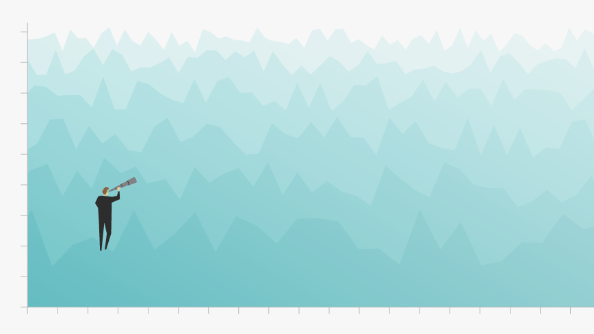
Technological advancements are taking data visualization in more useful and versatile directions, and the potential is great if marketers learn from past limitations. With cutting-edge techniques and approaches, new data visualization practices can light the way forward for a more knowledge-rich future for marketers.