With Luis Suárez making his debut in a Barcelona jersey on Monday in their 6-0 thrashing of Mexican Club Léon, I was keen to explore how global news outlets have covered the world’s most renowned odaxelagnist in the past year.
What a year it was. Suárez comfortably won the 2013-14 English Premier League scoring title by a margin of ten goals. On the other hand, his Liverpool side let the league title slip out of their hands by allowing middling Crystal Palace to recover from three goals down on the penultimate match of the season. Then, of course, there was the bite seen ’round the globe: During the Uruguayan’s narrow World Cup group stage victory over Italy on June 24th, he gnawed at an opponent for the third time of his increasingly infamous career.
Using a computational tool called Quid that I’ve recently fallen in love with, I carried out a network analysis of the nearly 5000 Luis Suárez-related news that appeared in highly-reputed outlets over the past twelve months. This gave me just the broad perspective I was looking for.
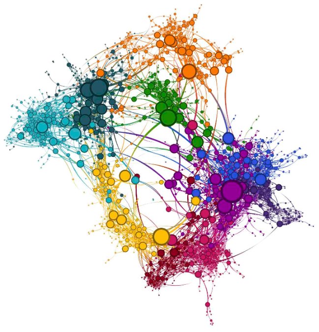
First off, here’s a pretty network diagram of the relationships of all the Suárez news stories. Each circle (node in the graph theory parlance) is a particular article with related articles connected by a line (edge). The more similar the content of two articles, the closer they appear together. And I set the diameter of each circle to be an indicator of how important the node is to the whole network (betweenness centrality).
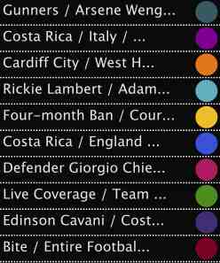
You’ve no doubt noticed that the nodes have been clustered into groups by their colour. Within each of these clusters (modules), the news articles are much more closely related to one another than to articles outside their module. These modules are key to enabling us to draw inferences from the data. To the left is a legend of the most important phrases within each of the ten modules.
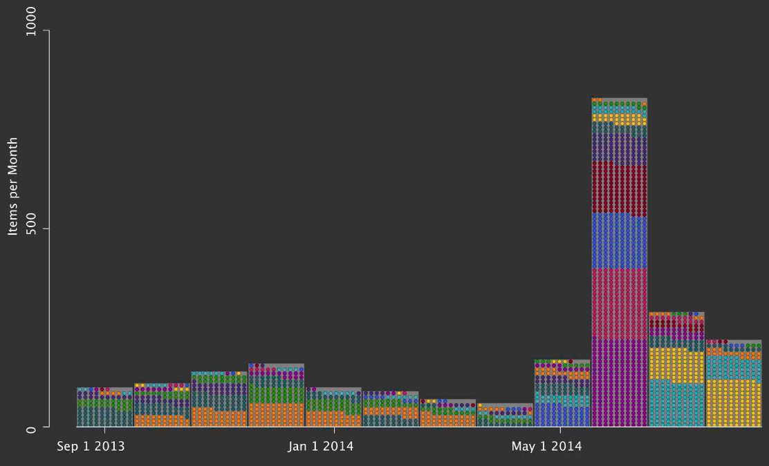
To understand the development of these modules, and the Suárez stories underlying them, over time, I displayed each article in bins representing the months of the year, as shown below.
From September 2013 through April 2014, the number of news articles per month were fairly consistent, with the vast majority of the stories emerging from English Premier League-related modules:
- the dark green module featuring the Gunners and Liverpool’s other Champions League-associated adversaries
- the orange module focuses on news related to other Liverpool opponents in the Prem like Cardiff, West Ham and West Brom
- while the green module includes other generic coverage of Liverpool trade stories and matches
Then, in May things start to kick off. This month had Liverpool losing the league to Manchester City in its final matches and World Cup-related news began to ramp up. This is reflected in the colours that month: we see the orange and greens of Liverpool and league play, but we also begin to see the blue of stories speculating on how England will perform against Suárez and Uruguay in the World Cup.
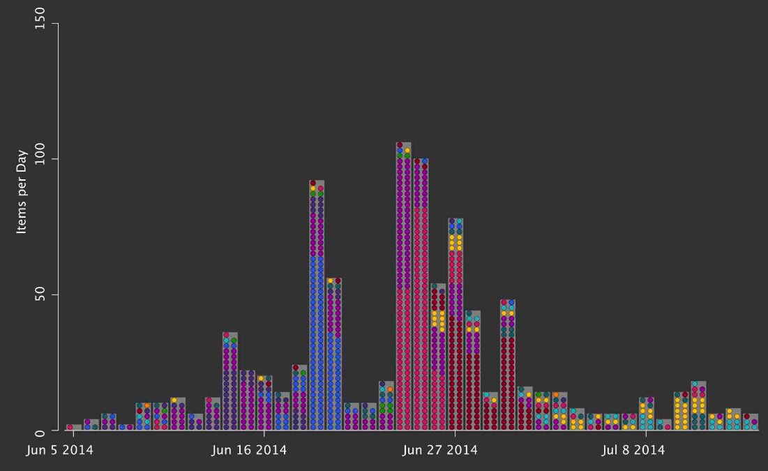
On June 24th, we reach the bite. So much Suárez news was generated around the globe in that June that it merits a closer examination. Here is breakdown of the forty days surrounding the event:
Gone are the orange and greens of Liverpool and the League. Now in addition to blue we see:
- violet: speculation and coverage of Uruguay’s group stage matches against Costa Rica (14th), England (19th), and Italy (24th)
- pink: the two most important phrases in this module are “Defender Giorgio Chiellini” and “shoulder”. These are stories of global bewilderment at the incident.
- red: Suárez admits to what he did and his apology is transmitted around the world. The key phrases in this module are “bite”, “Giorgio Chiellini”, and “entire football family”, reflecting excepts from Suárez’s apology speech that were quoted widely in mainstream media
Fascinating. Note the remarkable velocity of the pink and red modules. They each dominate the news for a couple of day or so and then they dissipate just as rapidly. This is the sound bite-driven, 24-hour news cycle caught in action. Another noteworthy item here is how the networking algorithm cleverly picks up the bite and the apology as separate themes — not a trivial exercise for a machine.
Finally, I find the Luis Suárez network as a whole unusual — but for a very good reason. Most networks I generate have a few central modules with more minor modules emanating from their centre. The Suárez network, however, is different: It’s a circle. This unusual property reflects the cyclical nature of both the sports competitions (EPL –> World Cup –> EPL) and geography (Europe –> Brazil –> Europe). Here’s a closer look that includes the most significant headlines from the stories that make up the nodes, covering them in the direction of time.
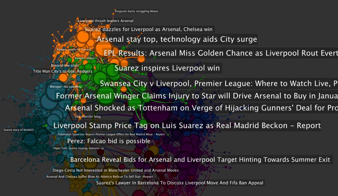
These are the orange and green news surrounding the 2013-14 EPL campaign, which connect along their right-hand side to:
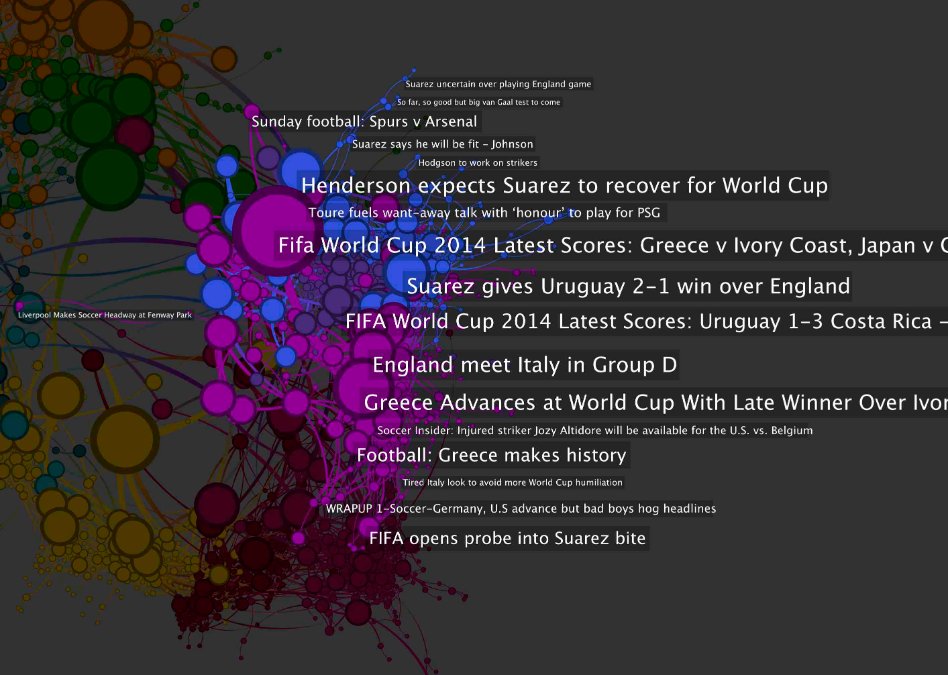
The blue, purple and violet of the World Cup build-up and early matches. These, in turn, lead naturally to:
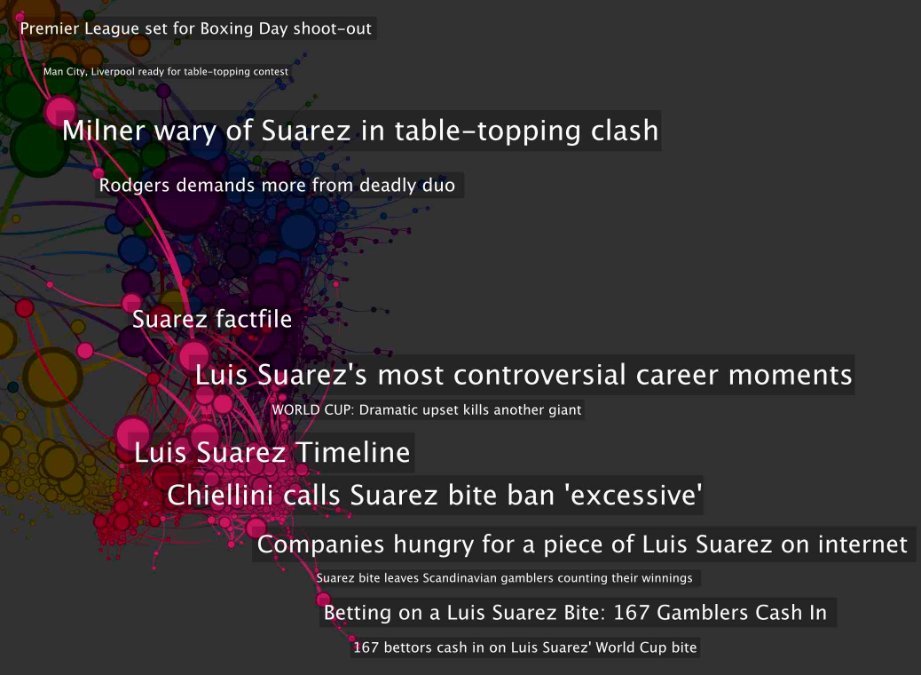
The pink and red of the bite and apology, respectively.
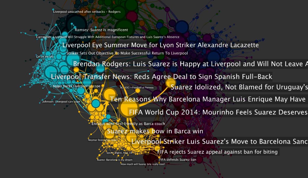
What follows has dominated the discussion in July and August so far:
- yellow: reporting and opinions on Suárez’s four-month competitive match ban, his shaming by the EPL, and his transfer to Barcelona
- teal: speculation and reporting on Liverpool’s performance without Suárez, with the three most important phrases being three of the clubs remaining stars: “Rickie Lambert”, “Adam Lallana”, and “Lazar Marković”
So, over the course of the year, our news network has brought us full circle. The yellow and teal modules have bridged us back to where we started, at the start of a fresh EPL campaign focused on Liverpool.
In an upcoming post, I’ll continue on with this Suárez example, but bring in assessments of the sentiment of the news articles. I’ll set out to answer questions such as: was sentiment more positive prior to June 24th? How did sentiment vary in the UK versus Spain or the US? Let me know what you think and anything else you might like to see.
Image Source: Associated Press

